
U-Eyes: Mobile Simulator
Test any website on iPhone & Android mobile devices. A powerful mobile simulator with screenshots & beautiful device mockups.
As of June 2026, U-Eyes: Mobile Simulator has 10,000 users and a 4.51/5 rating from 35 reviews in the Developer Tools category.
Usersno change0%
10.0K
10,000
Ratingdown 1.5 percent−1.5%
4.51
35 reviews
Reviewsup 12.9 percent+12.9%
35
Version
3.0.2
Manifest V3
History
4 snapshotsTracking since Apr 17, 2026.
View as table
| Date | Users | Rating | Reviews | Version |
|---|---|---|---|---|
| Apr 17, 2026 | 10.0K | 4.58 | 31 | 3.0.2 |
| Apr 27, 2026 | 10.0K | 4.58 | 31 | 3.0.2 |
| May 23, 2026 | 10.0K | 4.61 | 33 | 3.0.2 |
| Jun 2, 2026 | 10.0K | 4.62 | 34 | 3.0.2 |
| Now | 10.0K | 4.51 | 35 | 3.0.2 |
Permissions & access
- Permissions
- activeTabdeclarativeNetRequestdeclarativeNetRequestFeedbackscriptingtabCaptureoffscreenstorage
- Host access
- None declared
Screenshots


About
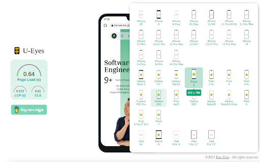
👁️ Welcome to U-Eyes, the ultimate Mobile simulator designed for developers, designers, QA testers, and marketers who demand pixel-perfect precision. In today's mobile-first world, ensuring your web projects look and function flawlessly across all devices is not just an option; it is a necessity. U-Eyes is your all-in-one toolkit, integrated directly into your Chrome browser, to test, capture, and share your responsive web designs with unparalleled ease and accuracy. Stop switching between multiple tools and your physical phone. Streamline your workflow with U-Eyes.

U-Eyes transforms your browser into a powerful and versatile testing environment. At its core, it provides an intuitive way to switch your browser's resolution to match a vast array of popular mobile devices. From the latest iPhones and Android flagships to various tablets, you can instantly see how your website adapts. This immediate feedback is crucial for nailing down your responsive design and catching layout issues before they reach your users.

🚀 Experience a true mobile view without ever leaving your desktop. Our extension meticulously adjusts the viewport, user agent, and touch events to emulate the real device environment as closely as possible. This isn't just about resizing a window; it's about creating a comprehensive testing ground for your responsive layouts.

Our device list includes but is not limited to:

Apple iPhone Series (17 Air, 16 Pro, SE, etc.)
Samsung Galaxy Series (S22, Z Fold, etc.)
Google Pixel Series (7, 6a, etc.)
Apple iPads and other tablets
Custom resolution and device profiles

✨ Beyond simple emulation, U-Eyes is a powerful responsive viewer that allows you to inspect and debug your CSS media queries in real-time. Identify breakpoints, adjust your styling, and ensure every element aligns perfectly, no matter the screen size. Our goal is to make responsive web development faster, more intuitive, and significantly more productive for you and your team.

📸 Capturing your work for presentations, bug reports, or portfolios has never been easier. U-Eyes includes a sophisticated screenshot tool with multiple powerful modes. You can capture exactly what you see within the emulated device screen, providing a clean, professional-looking image of your mobile layout. This is perfect for sharing progress with clients or logging visual bugs with precise context.

Need to create stunning visuals for your app store page or marketing materials? Our screenshot functionality includes an optional high-fidelity device mockup feature. With a single click, you can frame your screenshot within a sleek, realistic phone body. Create a beautiful iphone mockup to showcase your iOS-optimized design or use a generic phone mockup for broader appeal. This feature elevates your screenshots from simple captures to presentation-ready assets.

But what about pages that are longer than the screen? We have you covered. U-Eyes features a full-page screenshot capability that automatically scrolls down the page and stitches together a complete, high-resolution image. Capture everything from the header to the footer in one seamless file, saving you the hassle of manual scrolling and image editing. This is a game-changer for documenting long landing pages or entire user flows.

🎬 Sometimes a static image isn't enough to demonstrate a feature or document a complex bug. That is why U-Eyes includes a built-in screen recorder. Record your interactions within the mobile emulator and save them as a crisp, lightweight WebM video file. This is ideal for creating short demos, tutorials, or providing developers with a clear, animated bug report that shows exactly how to reproduce an issue. Perfect your screen mobile presentation with dynamic video.

☁️ Collaboration is key in modern web development. U-Eyes simplifies sharing with its integrated cloud upload feature. With a single click, you can upload any screenshot or video recording to a secure cloud service and instantly get a shareable link. No more emailing large files or struggling with third-party hosting services. Share your work with colleagues and clients effortlessly.

This powerful Mobile simulator extension is built for a variety of professionals: ➤ Web Developers: Debug media queries and test JavaScript events in a controlled mobile environment. ➤ UI/UX Designers: Quickly check design consistency and user experience across dozens of screen sizes. ➤ QA Testers: Document bugs with precise visual evidence using annotated screenshots and video recordings. ➤ Marketers & Project Managers: Create stunning promotional materials and present project progress with professional mockups.

Frequently Asked Questions
Q: How do I view webpage as mobile using this extension? A: It is incredibly simple. Once you install U-Eyes, just navigate to the webpage you want to test, click the U-Eyes icon in your browser toolbar, and select a device from our extensive list. The page will instantly reload in a perfectly sized mobile view, emulating the chosen device.

Q: Is this tool more than just a phone simulator? A: Absolutely. While its core function is a high-fidelity phone simulator, U-Eyes is a complete workflow enhancement tool. It combines emulation with advanced screenshot capabilities (including full-page and mockups), screen recording, and cloud sharing. It is a comprehensive suite designed to cover all your responsive testing and documentation needs.

Q: Can I trust this mobile browser extension with my work? A: Yes. U-Eyes operates entirely locally within your browser. Your data, screenshots, and recordings are your own. The optional cloud upload feature only activates when you explicitly choose to share a file, and it uses a secure connection to do so.

Why choose U-Eyes? Here is a summary of its standout benefits: • All-in-One Solution: No need for multiple extensions for testing, screenshots, and recording. • High Accuracy: Emulates device resolutions and user agents for reliable testing. • Workflow Efficiency: Capture, annotate, and share your findings in seconds, not minutes. • Professional Presentation: The device mockup feature makes your work look its best. • Lightweight and Fast: Built to be performant and not slow down your browser.

Here is what you get with the U-Eyes toolkit:
1️⃣ A massive, up-to-date list of mobile and tablet devices.
2️⃣ One-click screenshots with an optional, beautiful device mockup.
3️⃣ Full-page, scrolling screenshots for long pages.
4️⃣ High-quality screen recording to WebM video.
5️⃣ Instant cloud uploading for easy sharing and collaboration.

Stop guessing how your website looks on mobile. Install U-Eyes: Mobile Simulator today and take complete control of your responsive design workflow. See your work through your users' eyes and deliver a flawless mobile experience every single time.
Technical
- Version
- 3.0.2
- Manifest
- V3
- Size
- 15.59MiB
- Min Chrome
- 118
- Languages
- 52
- Featured
- Yes
Metadata
- ID
- pjldgnhfobpnhbdmfmofkfppdilefnjj
- Developer ID
- u16fd6e5867fc5eddd93799aca0ee8f5f
- Developer Email
- [email protected]
- Created
- Jun 25, 2023
- Last Updated (Store)
- Nov 30, 2025
- Last Scraped
- Jun 2, 2026
- Website
- —
- Support URL
- —
Similar extensions
Alternatives to U-Eyes: Mobile Simulator, ranked by description similarity.
Mobile Simulator Extension: Responsive Viewer
Professional mobile device simulator with multiple views, extensive device library, and sync scrolling
1.0K
★ 5.0
WeDoo All-in-One Screenshots
Easily capture responsive screenshots for any website. Test full page or visible area on popular desktop, mobile, & tablet devices.
18
★ 5.0
Screenlytic
Advanced mobile device emulator with responsive viewer, multi-device layout, touch events, and authentic mobile interaction
—
Mobile Preview Dev
Preview any webpage in mobile device views - built for developers
44
ViewPortify – Mobile Simulator & Responsive Design Testing Tool for Chrome
Mobile simulator for testing responsive designs across devices. Instantly preview and resize viewports in Chrome.
31
Instant Mobile Preview - Side Panel View
View mobile versions of websites side-by-side in Chrome's side panel.
750
★ 4.0
ScreenLab
Your personal lab for building your project in multiple screens
8
★ 5.0
ResponsiveSnap – Test Page Responsiveness Instantly
Capture full-page screenshots: See your website like your visitors do.
10
Data sourced from the Chrome Web Store · last verified Jun 2, 2026.