
Mobile Simulator Extension: Responsive Viewer
Professional mobile device simulator with multiple views, extensive device library, and sync scrolling
As of June 2026, Mobile Simulator Extension: Responsive Viewer has 1,000 users and a 5.00/5 rating from 4 reviews in the Developer Tools category.
Usersup 91.6 percent+91.6%
1.0K
1,000
Ratingno change0%
5.00
4 reviews
Reviewsno change0%
4
Version
2.0
Manifest V3
History
6 snapshotsTracking since Apr 1, 2026.
View as table
| Date | Users | Rating | Reviews | Version |
|---|---|---|---|---|
| Apr 1, 2026 | 522 | 5.00 | 4 | 2.0 |
| Apr 19, 2026 | 549 | 5.00 | 4 | 2.0 |
| Apr 28, 2026 | 666 | 5.00 | 4 | 2.0 |
| May 8, 2026 | 758 | 5.00 | 4 | 2.0 |
| May 16, 2026 | 870 | 5.00 | 4 | 2.0 |
| May 25, 2026 | 934 | 5.00 | 4 | 2.0 |
| Now | 1.0K | 5.00 | 4 | 2.0 |
Permissions & access
- Permissions
- activeTabscriptingstorage
- Host access
- None declared
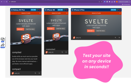
Screenshots


About
Mobile Simulator Extension: Responsive Viewer
Test, preview, and debug responsive designs across a massive library of mobile devices and tablets with the most powerful Mobile Simulator Extension on the Chrome Web Store.

🚀 Why Choose Mobile Simulator Pro?
Designing for the modern web requires testing across dozens of screen sizes. Mobile Simulator Extension: Responsive Viewer transforms your browser into a professional testing suite, allowing you to simulate any smartphone or tablet directly on your desktop.

📱 Extensive Device Library
Stop guessing how your site looks. Our Mobile Simulator provides high-fidelity frames for:

1) Apple iOS: iPhone 15 Pro, iPhone 14 Pro Max, iPhone SE, and iPad Pro.
2) Android Suite: Samsung Galaxy S22, Pixel 7, and Xiaomi Mi 11.
3) Tablets: iPad Air, iPad Mini, and Android Galaxy Tab S8.
4) Custom Devices: Need a specific breakpoint? Use our Custom Device tool to enter any width and height.

🔥 Top Professional Features

Sync Scroll (Synchronized Scrolling): Scroll on one device and watch all other simulated screens follow in real-time. Perfect for side-by-side comparison testing.

Multi-View Mode: Open 2, 3, or 4 devices simultaneously to view your entire responsive grid at once.

Device Frames & Notches: See your website exactly as your users do, including hardware frames and screen notches for a realistic Mobile View.

One-Click Rotation: Instantly toggle between Portrait and Landscape modes to test orientation changes.

Quick Action Sets: Use pre-configured bundles like the "Popular 3-Pack" or "iOS Set" to speed up your workflow.

🛠 Built for Developers & Designers
Whether you are a web developer debugging a CSS issue or a designer performing a UX audit, this Responsive Viewer provides a seamless environment to ensure your site is mobile-friendly. It is the ultimate alternative to the native Chrome DevTools, offering a more visual and intuitive Mobile Simulator experience.

✅ Key Keywords Covered:
- Mobile Simulator Extension
- Responsive Viewer Chrome Extension
- Mobile View Extension
- Smartphone Simulator
- Device Simulator for Chrome

Transform your workflow today. Install the Mobile Simulator Extension: Responsive Viewer and build a better mobile web.
Technical
- Version
- 2.0
- Manifest
- V3
- Size
- 74.71KiB
- Min Chrome
- 88
- Languages
- 1
- Featured
- No
Metadata
- ID
- peipdddkaeomnfdenmkddkapeemjomnb
- Developer ID
- ubcaa1b9a6726fffff2b3dc51bd3cbe0a
- Developer Email
- [email protected]
- Created
- Dec 23, 2025
- Last Updated (Store)
- Dec 24, 2025
- Last Scraped
- Jun 4, 2026
- Website
- —
- Support URL
- —
- Privacy Policy
- —
Similar extensions
Alternatives to Mobile Simulator Extension: Responsive Viewer, ranked by description similarity.
Mobi-Sim
Preview websites in realistic mobile device frames instantly.
3
Mobile Preview Dev
Preview any webpage in mobile device views - built for developers
44
ViewPortify – Mobile Simulator & Responsive Design Testing Tool for Chrome
Mobile simulator for testing responsive designs across devices. Instantly preview and resize viewports in Chrome.
31
Instant Mobile Preview - Side Panel View
View mobile versions of websites side-by-side in Chrome's side panel.
750
★ 4.0
Screenlytic
Advanced mobile device emulator with responsive viewer, multi-device layout, touch events, and authentic mobile interaction
—
U-Eyes: Mobile Simulator
Test any website on iPhone & Android mobile devices. A powerful mobile simulator with screenshots & beautiful device mockups.
10.0K
★ 4.5
MobileLens – Mobile Simulator
Simulate mobile browsers by spoofing user agent, headers, and viewport for UX testing.
12
Mobile View: Test responsive designs fast
Test your responsive designs on multiple devices at once.
20.0K
★ 4.3
Data sourced from the Chrome Web Store · last verified Jun 4, 2026.