
Instant Mobile Preview - Side Panel View
View mobile versions of websites side-by-side in Chrome's side panel.
As of June 2026, Instant Mobile Preview - Side Panel View has 750 users and a 4.00/5 rating from 2 reviews in the Developer Tools category.
Usersup 20.0 percent+20.0%
750
750
Ratingno change0%
4.00
2 reviews
Reviewsno change0%
2
Version
1.0.1
Manifest V3
History
4 snapshotsTracking since Apr 1, 2026.
View as table
| Date | Users | Rating | Reviews | Version |
|---|---|---|---|---|
| Apr 1, 2026 | 625 | 4.00 | 2 | 1.0.1 |
| Apr 21, 2026 | 655 | 4.00 | 2 | 1.0.1 |
| May 6, 2026 | 688 | 4.00 | 2 | 1.0.1 |
| Jun 4, 2026 | 713 | 4.00 | 2 | 1.0.1 |
| Now | 750 | 4.00 | 2 | 1.0.1 |
Permissions & access
- Permissions
- sidePanelactiveTabcontextMenusdeclarativeNetRequest
- Host access
- <all_urls>
Screenshots


About
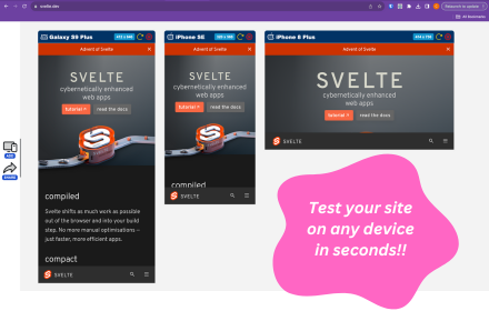
Side Panel Mobile View is a simple Chrome extension designed to streamline mobile testing and boost web development productivity. With this tool, you can instantly view a side-by-side mobile version of any website directly within your browser. By leveraging built-in device emulation, the extension provides an accurate website mobile view that helps you test mobile responsiveness, analyze design elements, and perform competitive research with ease.

Note: Does not work for some websites due to Content Security Policies (CSP) including X/Twitter and Facebook.

🚀 Key Features & Benefits
Instant Mobile Testing:
Quickly switch to a mobile preview without leaving your current webpage. The extension seamlessly opens a side panel, allowing you to view and test the mobile version of any website side-by-side with its desktop counterpart. This real-time mobile responsiveness testing saves time and streamlines your workflow.

Enhanced Mobile Responsiveness:
Use built-in device emulation to render an accurate mobile view. Ensure your website looks great on smartphones by checking its layout, functionality, and performance as you make design updates. Ideal for developers, UX/UI designers, and product managers aiming to perfect their mobile experience.

User-Friendly Interface:
The extension offers a minimalistic and intuitive design. Activate the mobile view easily via the Chrome toolbar icon or by right-clicking on a webpage and selecting “See Mobile View.” With independent scrolling in the mobile preview, you can inspect every detail without interference.

Optimized for Performance:
Engineered to be lightweight and fast, Side Panel Mobile View ensures that your browser remains responsive. The mobile view loads within seconds, providing an efficient tool for on-the-fly mobile testing and rapid iterations.

✅ Why Install Side Panel Mobile View?
Streamline Your Workflow:
Eliminate the need to switch between tabs or external devices for mobile testing. With a single click, get an immediate mobile preview right inside your Chrome browser.

Improve Mobile Responsiveness:
Ensure your websites meet high standards of mobile responsiveness by testing designs in real time. Detect and resolve issues early, leading to a smoother user experience across all devices.

Boost Productivity:
Designed with efficiency in mind, this extension minimizes load times and resource usage while providing comprehensive mobile view capabilities. Spend less time configuring setups and more time perfecting your designs.

Optimized for Web Professionals:
Whether you're a developer, designer, or product manager, Side Panel Mobile View delivers the insights you need to create engaging, responsive web experiences. It’s the perfect tool for competitive research, responsive design testing, and on-the-go mobile previewing.

✨ Perfect for:
Web Developers
UX/UI Designers
Product Managers
Quality Assurance Teams

Keywords:
mobile responsiveness, mobile testing, website mobile view, responsive design, device emulation, mobile preview, web development, Chrome extension, mobile web, UX/UI design, competitive research, performance testing

Get Started Today:
Transform the way you test and optimize mobile web experiences. Install Side Panel Mobile View from the Chrome Web Store and leave us feedback!
Technical
- Version
- 1.0.1
- Manifest
- V3
- Size
- 18.45KiB
- Min Chrome
- 88
- Languages
- 1
- Featured
- No
Metadata
- ID
- egfhlhjcihkmnnceiefabmhifikjjfgm
- Developer ID
- ueb37c51539fa545533dd32bcd16147b8
- Developer Email
- [email protected]
- Created
- Mar 23, 2025
- Last Updated (Store)
- Apr 23, 2025
- Last Scraped
- Jun 4, 2026
- Website
- —
- Support URL
- —
- Privacy Policy
- —
Similar extensions
Alternatives to Instant Mobile Preview - Side Panel View, ranked by description similarity.
Mobile Preview Dev
Preview any webpage in mobile device views - built for developers
44
Mobile View: Test responsive designs fast
Test your responsive designs on multiple devices at once.
20.0K
★ 4.3
Mobile Simulator Extension: Responsive Viewer
Professional mobile device simulator with multiple views, extensive device library, and sync scrolling
1.0K
★ 5.0
Screenlytic
Advanced mobile device emulator with responsive viewer, multi-device layout, touch events, and authentic mobile interaction
—
ViewPortify – Mobile Simulator & Responsive Design Testing Tool for Chrome
Mobile simulator for testing responsive designs across devices. Instantly preview and resize viewports in Chrome.
31
Responsive Preview
Preview websites across multiple device screen sizes simultaneously.
19
Responsive View
View websites in different device frames with responsive design preview
44
★ 5.0
Simple Mobile View
Simulate the mobile display for a webpage.
95
Data sourced from the Chrome Web Store · last verified Jun 4, 2026.