Be Responsive
Be Responsive helps you to build smooth and responsive websites by rendering your website in both desktop and mobile view.
As of May 2026, Be Responsive has 411 users and a 2.33/5 rating from 3 reviews in the Developer Tools category.
Usersup 4.3 percent+4.3%
411
411
Ratingno change0%
2.33
3 reviews
Reviewsno change0%
3
Version
1.0
Manifest V3
History
2 snapshotsTracking since Apr 25, 2026.
View as table
| Date | Users | Rating | Reviews | Version |
|---|---|---|---|---|
| Apr 25, 2026 | 394 | 2.33 | 3 | 1.0 |
| May 22, 2026 | 428 | 2.33 | 3 | 1.0 |
| Now | 411 | 2.33 | 3 | 1.0 |
Permissions & access
- Permissions
- None declared
- Host access
- None declared
Screenshots
About
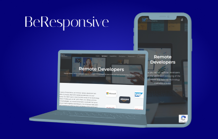
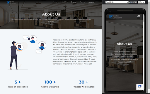
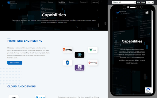
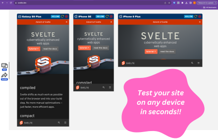
This extension will render your website in both desktop and mobile view simultaneously. This allows users to view and test the responsiveness of web pages across devices without having to navigate to separate pages or resize the browser window.


Make your development Effective
By using Be Responsive
Technical
- Version
- 1.0
- Manifest
- V3
- Size
- 1.53MiB
- Min Chrome
- 88
- Languages
- 1
- Featured
- Yes
Metadata
- ID
- pfcbcoagfnebpkdibhobjehbphbkdafh
- Developer ID
- u4da4eaa7e889cc832e65e0dd40e1ff8a
- Developer Email
- [email protected]
- Created
- Jan 13, 2023
- Last Updated (Store)
- Jan 13, 2023
- Last Scraped
- May 22, 2026
- Website
- bluetickconsultants.com
- Support URL
- —
- Privacy Policy
- —
Similar extensions
Alternatives to Be Responsive, ranked by description similarity.
Mobile View: Test responsive designs fast
Test your responsive designs on multiple devices at once.
20.0K
★ 4.3
Mobile Preview Dev
Preview any webpage in mobile device views - built for developers
44
Responsive Preview
Preview websites across multiple device screen sizes simultaneously.
19
Responsive Viewer
View any webpage in different device dimensions with custom sizing
391
★ 5.0
Mobile Simulator Extension: Responsive Viewer
Professional mobile device simulator with multiple views, extensive device library, and sync scrolling
1.0K
★ 5.0
Instant Mobile Preview - Side Panel View
View mobile versions of websites side-by-side in Chrome's side panel.
750
★ 4.0
ViewPortify – Mobile Simulator & Responsive Design Testing Tool for Chrome
Mobile simulator for testing responsive designs across devices. Instantly preview and resize viewports in Chrome.
31
Responsive extension
Extension for responsive design
18
Data sourced from the Chrome Web Store · last verified May 22, 2026.