Fluid Engine Tablet Spacing Fixer
Makes Squarespace's mobile breakpoint larger so that you can fix Fluid Engine spacing issues on screen sizes between mobile & tablet
As of May 2026, Fluid Engine Tablet Spacing Fixer has 1,000 users and a 4.44/5 rating from 16 reviews in the Developer Tools category.
Usersno change0%
1.0K
1,000
Ratingup 0.9 percent+0.9%
4.44
16 reviews
Reviewsup 6.7 percent+6.7%
16
Version
0.1.6
Manifest V3
History
2 snapshotsTracking since Apr 21, 2026.
View as table
| Date | Users | Rating | Reviews | Version |
|---|---|---|---|---|
| Apr 21, 2026 | 1.0K | 4.40 | 15 | 0.1.6 |
| May 6, 2026 | 1.0K | 4.40 | 15 | 0.1.6 |
| Now | 1.0K | 4.44 | 16 | 0.1.6 |
Permissions & access
- Permissions
- scriptingactiveTab
- Host access
- *://*.squarespace.com/config*
Screenshots
About
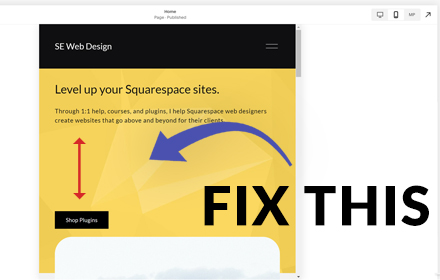
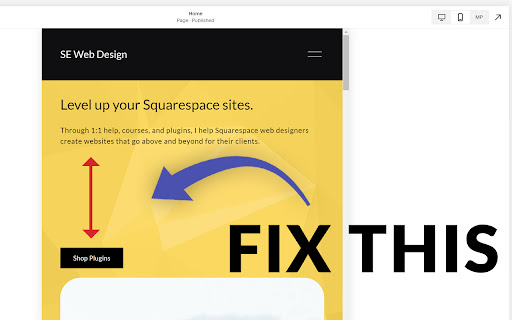
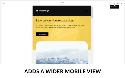
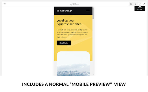
If you are using Squarespace 7.1's new Fluid Engine editor, you might have noticed that your text blocks get TONS of space between them on screen sizes between 600px and 767px (between mobile and tablet) with no way to remove it.

This is because of the way Fluid Engine maps blocks to the grid. The remedy is to map blocks to the grid on a screen size of 767px. When mapping them at this width, the spacing issues are resolved.

This extension automatically makes your 7.1 site's mobile view 767px wide, so you don't have to resize the window yourself. It also provides a "mobile preview" mode, that shows the original mobile view in additional to the 767px editing view, so you can see what your site looks like across more screen sizes.

This will provide a much needed fix until (hopefully) Squarespace gives us an editable tablet view in the future. Then at that time you can uninstall this extension.
Technical
- Version
- 0.1.6
- Manifest
- V3
- Size
- 13.11KiB
- Min Chrome
- 88
- Languages
- 1
- Featured
- No
Metadata
- ID
- gemmfnoajaghnaddkccmekbchdgckdab
- Developer ID
- u9c7d487cce24279e6de1c5581eac9aa8
- Developer Email
- [email protected]
- Created
- Sep 22, 2022
- Last Updated (Store)
- Jul 11, 2025
- Last Scraped
- May 31, 2026
- Privacy Policy
- —
Similar extensions
Alternatives to Fluid Engine Tablet Spacing Fixer, ranked by description similarity.
Onwards & Upwards — Squarespace Dev Tools
Runs OU script on Squarespace /config pages.
2
Window Resizer
Resize the specific viewport of the window to 1:1, 16:9, and more.
17
Mobile Simulator Extension: Responsive Viewer
Professional mobile device simulator with multiple views, extensive device library, and sync scrolling
1.0K
★ 5.0
LayoutLab–Master Your Webpage Layouts
Professional measurement toolkit: Grid overlay, ruler tool, and box measurements for pixel-perfect web development
—
Pixefy - Responsive Design Checker
Preview and debug your website’s responsiveness across multiple devices in real-time, all inside one browser tab.
10.0K
★ 4.5
Tailwind Breakpoint Viewer
Display the current Tailwind CSS breakpoint and viewport width in a draggable indicator
203
flexunits
The extension helps to convert pixels into viewport units from figma layouts.
36
★ 5.0
Responsive Tester Extension
Test website responsiveness across devices
32
Data sourced from the Chrome Web Store · last verified May 31, 2026.