
flexunits
The extension helps to convert pixels into viewport units from figma layouts.
As of May 2026, flexunits has 36 users and a 5.00/5 rating from 1 reviews in the Developer Tools category.
Usersup 2.9 percent+2.9%
36
36
Ratingno change0%
5.00
1 reviews
Reviewsno change0%
1
Version
1.2.1
Manifest V3
History
2 snapshotsTracking since Apr 25, 2026.
View as table
| Date | Users | Rating | Reviews | Version |
|---|---|---|---|---|
| Apr 25, 2026 | 35 | 5.00 | 1 | 1.2.1 |
| May 22, 2026 | 34 | 5.00 | 1 | 1.2.1 |
| Now | 36 | 5.00 | 1 | 1.2.1 |
Permissions & access
- Permissions
- None declared
- Host access
- None declared
Screenshots
About
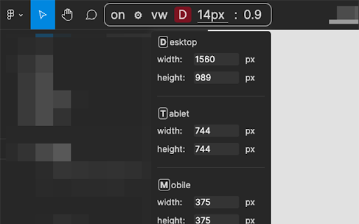
Flexunits is an extension for converting size of elements in pixels into viewport units: vw and vh.
It has three states: desktop, tablet and mobile, which can be easily configured by setting width and height.
The extension only works with figma layouts.
Flexunits can save developers' time for calculations.
Technical
- Version
- 1.2.1
- Manifest
- V3
- Size
- 18.05KiB
- Min Chrome
- 88
- Languages
- 1
- Featured
- Yes
Metadata
- ID
- kaalpfjkljdefmbikmljdhjclkanofdg
- Developer ID
- u94e49317e9814adbb66fce32b8c6b2d4
- Developer Email
- [email protected]
- Created
- Feb 16, 2022
- Last Updated (Store)
- May 24, 2023
- Last Scraped
- May 22, 2026
- Website
- —
- Support URL
- —
- Privacy Policy
- —
Similar extensions
Alternatives to flexunits, ranked by description similarity.
CSS PX, REM, EM, VH, VW Converter
Shows CSS size properties for elements
89
★ 5.0
Window Resizer
Resize the specific viewport of the window to 1:1, 16:9, and more.
17
Viewport Wiggler
Show viewport size and resize Chrome window to custom dimensions.
15
PX to VW
Easily convert PX to VW and VW to PX.
1.0K
★ 5.0
Modern CSS Unit Converter
Premium CSS unit converter for PX, VW, VH, %, REM, and EM. Features smart presets, dark mode, and instant bidirectional conversion.
5
CSS Unites
CSS Unites specially develop for Frontend Engineers.
143
★ 5.0
UnitShift — CSS Unit Converter for DevTools
Convert px, rem, and em units with one click inside Chrome DevTools. Select any element and apply conversions live.
10
CSS px/vw/clamp 計算機
CSS実装時に必要な px / vw / rem / clamp / line-height / aspect-ratio / grid など、複数の単位計算を 1 つのパネルにまとめた開発支援ツールです。
4
Data sourced from the Chrome Web Store · last verified May 22, 2026.