
Responsive Buddy
Test mobile layouts of your web pages in 2 clicks.
As of June 2026, Responsive Buddy has 154 users in the Developer Tools category.
Usersup 27.3 percent+27.3%
154
154
Ratingno change0%
—
— reviews
Reviewsno change0%
—
Version
1.0.3
Manifest V3
History
11 snapshotsTracking since Apr 1, 2026.
View as table
| Date | Users | Rating | Reviews | Version |
|---|---|---|---|---|
| Apr 1, 2026 | 121 | — | — | 1.0.3 |
| Apr 21, 2026 | 128 | — | — | 1.0.3 |
| Apr 26, 2026 | 135 | — | — | 1.0.3 |
| May 1, 2026 | 159 | — | — | 1.0.3 |
| May 6, 2026 | 155 | — | — | 1.0.3 |
| May 10, 2026 | 163 | — | — | 1.0.3 |
| May 14, 2026 | 147 | — | — | 1.0.3 |
| May 18, 2026 | 150 | — | — | 1.0.3 |
| May 22, 2026 | 151 | — | — | 1.0.3 |
| May 27, 2026 | 159 | — | — | 1.0.3 |
| Jun 1, 2026 | 160 | — | — | 1.0.3 |
| Now | 154 | — | — | 1.0.3 |
Permissions & access
- Permissions
- activeTabstorage
- Host access
- None declared
Screenshots

About
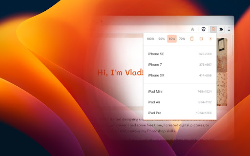
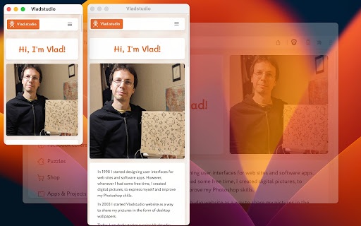
As a web developer, I need to constantly check my designs on large and small screens. I tried many Chrome extensions that test responsive designs, but most of them were too bloated or inconvenient. So I created my own. I've been using it daily, so I thought – why not publish it, maybe it will be useful for you too!

~*~ 3 PHONES, 3 TABLES ~*~

Most extensions require that I configure my own list of favorite devices. Responsive Buddy offers 3 phone and 3 tablet sizes, from small to large.

~*~ ZOOM OUT (100 to 70%) ~*~

Useful if you want to compensate the difference between your monitod DPI (pixel density) and the DPI of a target mobile device.

~*~ PORTRAIT / LANDSCAPE ~*~

Switch between portrait and landscape orientation with a click of a button.

~*~ IFRAME MODE OFF BUTTON ~*~

By default, Responsive Buddy creates a window with an iframe, then transforms it to the selected zoom setting. It works well, unless your website refuses to be opened in an iframe. If that's the case, you can turn "iframe mode" off.

~*~ DARK MODE SUPPORT ~*~

Your eyes will thank you!
Technical
- Version
- 1.0.3
- Manifest
- V3
- Size
- 33.18KiB
- Min Chrome
- 88
- Languages
- 1
- Featured
- Yes
Metadata
- ID
- pkpodanfippddohhfchdmebebbepjkkf
- Developer ID
- ub758be4f05f6ea738f77f334412e6570
- Developer Email
- [email protected]
- Created
- Jan 30, 2023
- Last Updated (Store)
- Mar 3, 2026
- Last Scraped
- Jun 5, 2026
- Website
- —
- Support URL
- https://responsive-buddy.vlad.studio/privacy
- Privacy Policy
- https://responsive-buddy.vlad.studio/privacy
Similar extensions
Alternatives to Responsive Buddy, ranked by description similarity.
Responsive View
View websites in different device frames with responsive design preview
44
★ 5.0
Screenlytic
Advanced mobile device emulator with responsive viewer, multi-device layout, touch events, and authentic mobile interaction
—
Mobile Preview Dev
Preview any webpage in mobile device views - built for developers
44
Responsive Preview
Preview websites across multiple device screen sizes simultaneously.
19
Breakgrid – Responsive Viewport Tester
Resize your browser to common breakpoints in one click.
19
Responsive Lab
View multiple device viewports simultaneously for responsive design testing
25
Mobile Simulator Extension: Responsive Viewer
Professional mobile device simulator with multiple views, extensive device library, and sync scrolling
1.0K
★ 5.0
Screen Sizer
Resize your browser window to mimic different screen sizes. Save, manage and share presets with your team.
20
Data sourced from the Chrome Web Store · last verified Jun 5, 2026.