
ScreenSync — Responsive Preview
See your website on multiple screen sizes simultaneously. Live, side by side, as you code.
As of June 2026, ScreenSync — Responsive Preview has 14 users and a 5.00/5 rating from 1 reviews in the Developer Tools category.
Usersup 100.0 percent+100.0%
14
14
Ratingno change0%
5.00
1 reviews
Reviewsno change0%
1
Version
1.0.1
Manifest V3
History
6 snapshotsTracking since Apr 9, 2026.
View as table
| Date | Users | Rating | Reviews | Version |
|---|---|---|---|---|
| Apr 9, 2026 | 7 | — | — | 1.0.1 |
| Apr 20, 2026 | 12 | 5.00 | 1 | 1.0.1 |
| May 9, 2026 | 10 | 5.00 | 1 | 1.0.1 |
| May 14, 2026 | 11 | 5.00 | 1 | 1.0.1 |
| May 27, 2026 | 14 | 5.00 | 1 | 1.0.1 |
| Jun 3, 2026 | 17 | 5.00 | 1 | 1.0.1 |
| Now | 14 | 5.00 | 1 | 1.0.1 |
Permissions & access
- Permissions
- activeTabtabs
- Host access
- None declared
Screenshots


About
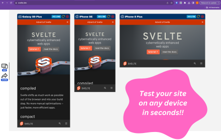
ScreenSync lets frontend developers preview their website on mobile, tablet, laptop, and desktop viewports simultaneously in a single Chrome tab.

Stop toggling Chrome DevTools device toolbar one screen size at a time. With ScreenSync, you see all sizes at once.

HOW IT WORKS
1. Open any website or localhost page
2. Click the ScreenSync icon
3. Select your viewports (Mobile, Tablet, Laptop, Desktop)
4. Hit Launch
5. See your site at all sizes in one view

FEATURES
 4 preset viewports: Mobile (375px), Tablet (768px), Laptop (1024px), Desktop (1440px)
 Custom viewport sizes: Add any width and height you need
 Synced scrolling: Scroll one viewport and all others follow proportionally
 Auto refresh mode: Automatically reloads all viewports every 2 seconds
 Zoom controls: Zoom in, zoom out, fit to screen
 Keyboard shortcuts: Press + to zoom in, 0 to reset, R to refresh all
 Works with localhost and any URL
 Lightweight: No separate app to download, works right in Chrome

PERFECT FOR
 Frontend developers testing responsive designs
 Freelancers building client websites
 Teams reviewing layouts across breakpoints
 Anyone who writes CSS and needs to check multiple screen sizes

WHY NOT JUST USE DEVTOOLS?
Chrome DevTools only shows one screen size at a time. You have to toggle back and forth, checking each size individually. ScreenSync shows all sizes simultaneously so you catch responsive bugs the moment you write the CSS.

NO DATA COLLECTION
ScreenSync does not collect, store, or transmit any user data. It works entirely within your browser.
Technical
- Version
- 1.0.1
- Manifest
- V3
- Size
- 15.13KiB
- Min Chrome
- 88
- Languages
- 1
- Featured
- No
Metadata
- ID
- badbhggphglcjmjikgibmpcinlncllni
- Developer ID
- u3a415df2f3432085b94ac3f464172753
- Developer Email
- [email protected]
- Created
- Feb 19, 2026
- Last Updated (Store)
- Mar 4, 2026
- Last Scraped
- Jun 3, 2026
- Website
- —
- Support URL
- —
- Privacy Policy
- https://innovtechai.com/screensync-privacy-policy/
Similar extensions
Alternatives to ScreenSync — Responsive Preview, ranked by description similarity.
ScreenLab
Your personal lab for building your project in multiple screens
8
★ 5.0
Responsive Preview
Preview websites across multiple device screen sizes simultaneously.
19
ResponsiveSnap – Test Page Responsiveness Instantly
Capture full-page screenshots: See your website like your visitors do.
10
Mobile Preview Dev
Preview any webpage in mobile device views - built for developers
44
Screen Sizer
Resize your browser window to mimic different screen sizes. Save, manage and share presets with your team.
20
ViewPortify – Mobile Simulator & Responsive Design Testing Tool for Chrome
Mobile simulator for testing responsive designs across devices. Instantly preview and resize viewports in Chrome.
31
Mobile Simulator Extension: Responsive Viewer
Professional mobile device simulator with multiple views, extensive device library, and sync scrolling
1.0K
★ 5.0
Mobile View: Test responsive designs fast
Test your responsive designs on multiple devices at once.
20.0K
★ 4.3
Data sourced from the Chrome Web Store · last verified Jun 3, 2026.