
Troy
Test responsive web pages by the real devices' screen size.
As of June 2026, Troy has 3,000 users and a 3.71/5 rating from 55 reviews in the Developer Tools category.
Usersdown 25.0 percent−25.0%
3.0K
3,000
Ratingno change0%
3.71
55 reviews
Reviewsno change0%
55
Version
1.0
Manifest V2
90-day change · In the last 90 days this extension lost 1.0K users.
History
2 snapshotsTracking since Apr 1, 2026.
View as table
| Date | Users | Rating | Reviews | Version |
|---|---|---|---|---|
| Apr 1, 2026 | 4.0K | 3.71 | 55 | 1.0 |
| May 2, 2026 | 3.0K | 3.71 | 55 | 1.0 |
| Now | 3.0K | 3.71 | 55 | 1.0 |
Permissions & access
- Permissions
- None declared
- Host access
- None declared
Screenshots


About
Troy was built to help you to test responsive websites on the various device-widths.

▶ 30+ testing environments (Samsung, Apple, LG, Google, Pantech, HTC, Sony, Xiaomi, Huawei, Lenovo, ZTE)
▶ Some websites with X-FRAME-OPTIONS will not be seen on the frame.
▶ The result screen may not be same with that on real devices and does not represent the real device's rendering issues.
▶ This application does not support User-Agent header modification.


contact us : [email protected]
Technical
- Version
- 1.0
- Manifest
- V2
- Size
- 15.76KiB
- Min Chrome
- —
- Languages
- 1
- Featured
- No
Metadata
- ID
- hflapaedaljpdhhdcdgkmhgmcncdchca
- Developer ID
- u0d815246510743208419af0b87c6411c
- Developer Email
- —
- Created
- Jul 31, 2013
- Last Updated (Store)
- Sep 25, 2014
- Last Scraped
- Jun 1, 2026
- Website
- http://troy.labs.daum.net/
- Support URL
- —
- Privacy Policy
- —
Similar extensions
Alternatives to Troy, ranked by description similarity.
ResponsiveFrame
Test responsive designs across multiple device viewports simultaneously. by AIO.com.ai
1
Responsive View
View websites in different device frames with responsive design preview
44
★ 5.0
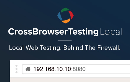
CrossBrowserTesting Local Connection
CrossBrowserTesting Local Connection lets you test behind your firewall in 1500+ real desktop and mobile browsers
4.0K
★ 3.3
RealClient Mirror
See your websites like your users do. Not the fancy equipment you use, but the real, small screens they have
4
Responsive Buddy
Test mobile layouts of your web pages in 2 clicks.
154
TestingBot
Cross Browser Testing on multiple browsers and mobile devices.
218
★ 1.0
Mobile Simulator Innoventix
Simulate mobile view on current website
41
Viewport Resizer: Ultimate Device Emulator & Website Testing Tool
Emulate devices, resize screens, and perfect your web design effortlessly with this cutting-edge testing and presentation tool.
80.0K
★ 4.2
Data sourced from the Chrome Web Store · last verified Jun 1, 2026.