
Mobile simulator - responsive testing tool
Smartphone and tablet simulator on computer with several models to test mobile responsive websites.
As of June 2026, Mobile simulator - responsive testing tool has 1,000,000 users and a 4.90/5 rating from 4,899 reviews in the Productivity category.
Usersno change0%
1.0M
1,000,000
Ratingno change0%
4.90
4.9K reviews
Reviewsup 6.3 percent+6.3%
4.9K
Version
4.17.0
Manifest V3
90-day change · In the last 90 days this extension 3 version updates.
History
24 snapshotsTracking since Apr 5, 2026.
View as table
| Date | Users | Rating | Reviews | Version |
|---|---|---|---|---|
| Apr 5, 2026 | 1.0M | 4.90 | 4.6K | 4.14.11 |
| Apr 8, 2026 | 1.0M | 4.90 | 4.6K | 4.14.12 |
| Apr 14, 2026 | 1.0M | 4.90 | 4.6K | 4.14.12 |
| Apr 19, 2026 | 1.0M | 4.90 | 4.7K | 4.14.12 |
| Apr 22, 2026 | 1.0M | 4.90 | 4.7K | 4.14.14 |
| Apr 25, 2026 | 1.0M | 4.90 | 4.7K | 4.14.15 |
| Apr 28, 2026 | 1.0M | 4.90 | 4.7K | 4.14.15 |
| May 5, 2026 | 1.0M | 4.90 | 4.7K | 4.14.15 |
| May 7, 2026 | 1.0M | 4.90 | 4.7K | 4.14.15 |
| May 10, 2026 | 1.0M | 4.90 | 4.7K | 4.15.4 |
| May 12, 2026 | 1.0M | 4.90 | 4.7K | 4.15.4 |
| May 14, 2026 | 1.0M | 4.90 | 4.7K | 4.15.4 |
| May 16, 2026 | 1.0M | 4.90 | 4.8K | 4.15.4 |
| May 19, 2026 | 1.0M | 4.90 | 4.8K | 4.15.4 |
| May 21, 2026 | 1.0M | 4.90 | 4.8K | 4.15.5 |
| May 24, 2026 | 1.0M | 4.90 | 4.8K | 4.15.5 |
| May 27, 2026 | 1.0M | 4.90 | 4.8K | 4.16.0 |
| May 30, 2026 | 1.0M | 4.90 | 4.8K | 4.16.0 |
| Jun 2, 2026 | 1.0M | 4.90 | 4.8K | 4.16.0 |
| Jun 5, 2026 | 1.0M | 4.90 | 4.8K | 4.16.0 |
| Jun 7, 2026 | 1.0M | 4.90 | 4.8K | 4.16.0 |
| Jun 10, 2026 | 1.0M | 4.90 | 4.9K | 4.17.0 |
| Jun 13, 2026 | 1.0M | 4.90 | 4.9K | 4.17.0 |
| Jun 19, 2026 | 1.0M | 4.90 | 4.9K | 4.17.0 |
| Now | 1.0M | 4.90 | 4.9K | 4.17.0 |
Changelog
- Jun 7, 2026description
🚀 Simulate mobile viewports, check responsive web design, create impactful client demos, and save hours of testing.

Mobile FIRST is the most powerful and reliable responsive simulator extension, trusted by developers and designers for over 5 years. Our rating on the Chrome Store speaks for itself!

📱 PRE-CONFIGURED DEVICES (New ones added regularly)
• 58+ devices ready to use out of the box
• 45 smartphones (old and recent models)
• 5 tablet models
• 11 special devices (smartwatches, kiosks, desktop...)

🔥 NEW & MAIN FEATURES
• 🛠️ Custom devices: Create and save your own devices with custom screen resolutions and viewports
• 👆 Realistic touch scrolling: Simulates native finger gestures for an authentic mobile browsing feel
• 🎬 One-click video capture (WEBM, GIF, MP4) for your demos and tutorials
• 📸 Transparent PNG screenshots, perfect for client emails or presentations
• 🌚 Dark mode for enhanced visual comfort

🎁 ALSO INCLUDED
• Free downloadable transparent device mockups
• Seamless landscape mode switching
• Realistic zoom mimicking actual mobile behavior
• More than 10 customization options (PWA mode, fullscreen, native keyboard, etc.)

✨ Inside Mobile FIRST, many technical tricks are integrated to reproduce the mobile experience as closely as possible.

(Note: While highly accurate for day-to-day dev, this simulator does not replace final testing on a real device for 100% full validation.)
🚀 Simulate mobile viewports, check responsive web design, create impactful client demos, and save hours of testing.

Mobile FIRST is the most powerful and reliable responsive simulator extension, trusted by developers and designers for over 5 years. Our rating on the Chrome Store speaks for itself!

📱 PRE-CONFIGURED DEVICES (New ones added regularly)
• 58+ devices ready to use out of the box
• 45 smartphones (old and recent models)
• 5 tablet models
• 11 special devices (smartwatches, kiosks, desktop...)

🔥 NEW & MAIN FEATURES
• 📱📱 Multi-device comparison: View and test multiple devices side-by-side simultaneously for faster responsive checks
• 🛠️ Custom devices: Create and save your own devices with custom screen resolutions and viewports
• 👆 Realistic touch scrolling: Simulates native finger gestures for an authentic mobile browsing feel
• 🎬 One-click video capture (WEBM, GIF, MP4) for your demos and tutorials
• 📸 Transparent PNG screenshots, perfect for client emails or presentations
• 🌚 Dark mode for enhanced visual comfort

🎁 ALSO INCLUDED
• Free downloadable transparent device mockups
• Seamless landscape mode switching
• Realistic zoom mimicking actual mobile behavior
• More than 10 customization options (PWA mode, fullscreen, native keyboard, etc.)

✨ Inside Mobile FIRST, many technical tricks are integrated to reproduce the mobile experience as closely as possible.

(Note: While highly accurate for day-to-day dev, this simulator does not replace final testing on a real device for 100% full validation.)
- May 24, 2026description
Check the rendering on multiple devices, create impactful client demos, and save time in your testing.

58 devices available (with new ones added regularly)
📱 45 smartphones (old and recent)
💻 5 tablet models
⌚️ 11 special devices (smartwatches, kiosks, computers…)

Main features
🎬 One-click video capture (WEBM, GIF, MP4) for your demos and tutorials
📸 Transparent PNG screenshots, perfect for emails or presentations
🌚 Dark mode for enhanced visual comfort

Also included
➡️ Free downloadable transparent device mockups
➡️ Option to switch to landscape mode
➡️ Zoom just like on a real mobile
➡️ More than 10 customization options (PWA mode, fullscreen, native keyboard, etc.)
➡️ User gesture for touch scrolling

Mobile FIRST has been the most powerful and reliable simulation extension for over 5 years.
Our rating on the Chrome Store speaks for itself.

✨ It integrates many technical tricks to reproduce the mobile experience as closely as possible.
Of course, this does not replace testing on a real device at the end of your development for full validation.
🚀 Simulate mobile viewports, check responsive web design, create impactful client demos, and save hours of testing.

Mobile FIRST is the most powerful and reliable responsive simulator extension, trusted by developers and designers for over 5 years. Our rating on the Chrome Store speaks for itself!

📱 PRE-CONFIGURED DEVICES (New ones added regularly)
• 58+ devices ready to use out of the box
• 45 smartphones (old and recent models)
• 5 tablet models
• 11 special devices (smartwatches, kiosks, desktop...)

🔥 NEW & MAIN FEATURES
• 🛠️ Custom devices: Create and save your own devices with custom screen resolutions and viewports
• 👆 Realistic touch scrolling: Simulates native finger gestures for an authentic mobile browsing feel
• 🎬 One-click video capture (WEBM, GIF, MP4) for your demos and tutorials
• 📸 Transparent PNG screenshots, perfect for client emails or presentations
• 🌚 Dark mode for enhanced visual comfort

🎁 ALSO INCLUDED
• Free downloadable transparent device mockups
• Seamless landscape mode switching
• Realistic zoom mimicking actual mobile behavior
• More than 10 customization options (PWA mode, fullscreen, native keyboard, etc.)

✨ Inside Mobile FIRST, many technical tricks are integrated to reproduce the mobile experience as closely as possible.

(Note: While highly accurate for day-to-day dev, this simulator does not replace final testing on a real device for 100% full validation.)
- May 7, 2026description
Check the rendering on multiple devices, create impactful client demos, and save time in your testing.

58 devices available (with new ones added regularly)
📱 45 smartphones (old and recent)
💻 5 tablet models
⌚️ 11 special devices (smartwatches, kiosks, computers…)

Main features
🎬 One-click video capture (WEBM, GIF, MP4) for your demos and tutorials
📸 Transparent PNG screenshots, perfect for emails or presentations
🌚 Dark mode for enhanced visual comfort

Also included
➡️ Free downloadable transparent device mockups
➡️ Option to switch to landscape mode
➡️ Zoom just like on a real mobile
➡️ More than 10 customization options (PWA mode, fullscreen, native keyboard, etc.)

Mobile FIRST has been the most powerful and reliable simulation extension for over 5 years.
Our rating on the Chrome Store speaks for itself.

✨ It integrates many technical tricks to reproduce the mobile experience as closely as possible.
Of course, this does not replace testing on a real device at the end of your development for full validation.
Check the rendering on multiple devices, create impactful client demos, and save time in your testing.

58 devices available (with new ones added regularly)
📱 45 smartphones (old and recent)
💻 5 tablet models
⌚️ 11 special devices (smartwatches, kiosks, computers…)

Main features
🎬 One-click video capture (WEBM, GIF, MP4) for your demos and tutorials
📸 Transparent PNG screenshots, perfect for emails or presentations
🌚 Dark mode for enhanced visual comfort

Also included
➡️ Free downloadable transparent device mockups
➡️ Option to switch to landscape mode
➡️ Zoom just like on a real mobile
➡️ More than 10 customization options (PWA mode, fullscreen, native keyboard, etc.)
➡️ User gesture for touch scrolling

Mobile FIRST has been the most powerful and reliable simulation extension for over 5 years.
Our rating on the Chrome Store speaks for itself.

✨ It integrates many technical tricks to reproduce the mobile experience as closely as possible.
Of course, this does not replace testing on a real device at the end of your development for full validation.
Permissions & access
- Permissions
- webRequestscriptingtabsactiveTabdeclarativeNetRequestwebNavigationstoragecontextMenustabCaptureoffscreencommands
- Host access
- <all_urls>, *://*/*
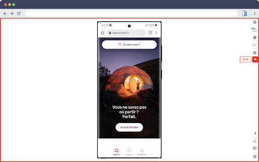
Screenshots


About
🚀 Simulate mobile viewports, check responsive web design, create impactful client demos, and save hours of testing.

Mobile FIRST is the most powerful and reliable responsive simulator extension, trusted by developers and designers for over 5 years. Our rating on the Chrome Store speaks for itself!

📱 PRE-CONFIGURED DEVICES (New ones added regularly)
• 58+ devices ready to use out of the box
• 45 smartphones (old and recent models)
• 5 tablet models
• 11 special devices (smartwatches, kiosks, desktop...)

🔥 NEW & MAIN FEATURES
• 📱📱 Multi-device comparison: View and test multiple devices side-by-side simultaneously for faster responsive checks
• 🛠️ Custom devices: Create and save your own devices with custom screen resolutions and viewports
• 👆 Realistic touch scrolling: Simulates native finger gestures for an authentic mobile browsing feel
• 🎬 One-click video capture (WEBM, GIF, MP4) for your demos and tutorials
• 📸 Transparent PNG screenshots, perfect for client emails or presentations
• 🌚 Dark mode for enhanced visual comfort

🎁 ALSO INCLUDED
• Free downloadable transparent device mockups
• Seamless landscape mode switching
• Realistic zoom mimicking actual mobile behavior
• More than 10 customization options (PWA mode, fullscreen, native keyboard, etc.)

✨ Inside Mobile FIRST, many technical tricks are integrated to reproduce the mobile experience as closely as possible.

(Note: While highly accurate for day-to-day dev, this simulator does not replace final testing on a real device for 100% full validation.)
Technical
- Version
- 4.17.0
- Manifest
- V3
- Size
- 9.88MiB
- Min Chrome
- 88
- Languages
- 51
- Featured
- Yes
Metadata
- ID
- ckejmhbmlajgoklhgbapkiccekfoccmk
- Developer ID
- u6e34d5e830fecb06af3295893410ed36
- Developer Email
- [email protected]
- Created
- May 5, 2020
- Last Updated (Store)
- Jun 5, 2026
- Last Scraped
- Jun 19, 2026
- Website
- webmobilefirst.com
- Privacy Policy
- https://www.webmobilefirst.com/en/privacy/
Similar extensions
Alternatives to Mobile simulator - responsive testing tool, ranked by description similarity.
Phone Simulator — Mobile Emulator Tool
Try Phone Simulator: test your site on iPhone, iPad & Android - mobile emulator. Online mobile simulator & website viewer.
20.0K
★ 4.8
Mobile Simulator for Chrome
Switch any Chrome tab to mobile view with 38 device options in one click.
604
★ 5.0
Mobile View Tester: Responsive Web Design Tool
Mobile-first design validation. Quickly preview and optimize website performance across multiple device screen sizes.
1.0K
★ 3.6
Free Mobile Simulatore - Responsiveness testing
Simulate mobile, tab and pc to test responsive website for free.
165
SimuLovice - Mobile Simulator & Mockup Generator
Simulate mobile devices, test responsive designs, and generate high-quality mockups directly from your browser tab.
177
★ 1.0
Switch to Mobile View
One click mobile viewport preview for any page.
734
★ 1.0
ScreenTest - Mobile Device Simulator
Test websites on 80+ mobile devices. Preview iPhone, Android, and tablets with realistic frames and responsive layouts.
89
Showesome
Quickly and simply, with just one click, showcase your website designs.
36
★ 5.0
Data sourced from the Chrome Web Store · last verified Jun 19, 2026.