
Responsive Website Testing Toolkit - Multiple Viewport Simulator
An essential tool to test the responsiveness of any website on multiple screens simultaneously
As of June 2026, Responsive Website Testing Toolkit - Multiple Viewport Simulator has 7,000 users and a 4.00/5 rating from 20 reviews in the Developer Tools category.
Usersup 75.0 percent+75.0%
7.0K
7,000
Ratingup 1.3 percent+1.3%
4.00
20 reviews
Reviewsup 5.3 percent+5.3%
20
Version
1.0.2
Manifest V3
90-day change · In the last 90 days this extension gained 3.0K users, 2 version updates.
History
4 snapshotsTracking since Apr 23, 2026.
View as table
| Date | Users | Rating | Reviews | Version |
|---|---|---|---|---|
| Apr 23, 2026 | 4.0K | 3.95 | 19 | 1.0.0 |
| May 13, 2026 | 5.0K | 3.95 | 19 | 1.0.0 |
| May 21, 2026 | 5.0K | 4.00 | 20 | 1.0.1 |
| Jun 16, 2026 | 6.0K | 4.00 | 20 | 1.0.2 |
| Now | 7.0K | 4.00 | 20 | 1.0.2 |
Permissions & access
- Permissions
- storagedownloadsdeclarativeNetRequestscripting
- Host access
- *://*/*, <all_urls>
Screenshots


About
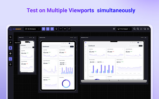
Simplify your web development and testing journey with Responsive Website Testing Toolkit, a comprehensive solution built to enhance testing, collaboration, and project organization. An advanced multi-device responsiveness testing tool that empowers developers and designers to work smarter and faster.

Key Features:

1. Test Responsiveness Across Multiple Viewports Simultaneously
Instantly preview your website on multiple devices in real time. Responsive Website Testing Toolkit lets you view layouts on smartphones, tablets, desktops, and more, helping you deliver pixel-perfect designs for every screen size.

2. Sync Mouse Clicks and Scroll Events Across Viewports
Test interactivity like never before! Sync mouse clicks, and scroll events across all viewports simultaneously, ensuring a seamless user experience across devices.

3. Customizable Viewports for Every Need
Design and test for any screen size with ease. ResponsiveSync Pro allows you to create custom viewports tailored to unique device requirements, giving you the flexibility to tackle any project.

4. Workspaces for Efficient Project Management
Stay organized with dedicated workspaces for every project. Manage viewports,  configurations in a single, user-friendly interface, making multi-project management a breeze.

5. Export and Import Projects and Settings
Seamlessly collaborate with your team or transfer projects between environments. Responsive Website Testing Toolkit supports exporting and importing projects and settings, ensuring continuity and productivity across your workflow.

6. Capture Screenshots Instantly
Document and share progress with one-click screenshot capabilities with or without the device Mockup.

Besides above mentioned key features there are more features to explore. We are actively working to introduce new features in a regular interval and improve the quality of the application.

Why Choose Responsive Website Testing Toolkit?

✅ Save Time: Simultaneous multi-device testing accelerates your workflow.
✅ Work Smart: Advanced features like synced actions and project exports boost efficiency.
✅ Be Flexible: Customize viewports and configurations to fit any requirement.
✅ Stay Organized: Streamline project management with intuitive workspaces.

Take your responsive web development and testing to the next level with Responsive Website Testing Toolkit, the all-in-one tool that delivers precision, flexibility, and convenience.

For any suggestions or feature request please reach out to us via the email which mentioned in the developer info.

Privacy Policy: https://rbrahul.github.io/privacy/responsiveness-webkit/
Technical
- Version
- 1.0.2
- Manifest
- V3
- Size
- 199KiB
- Min Chrome
- 88
- Languages
- 1
- Featured
- No
Metadata
- ID
- pahjcficmhfgjkdcdadnacjdiinpilmd
- Developer ID
- ube0a766bf57fbe5836abac8ce7e17133
- Developer Email
- [email protected]
- Created
- Dec 4, 2024
- Last Updated (Store)
- May 19, 2026
- Last Scraped
- Jun 16, 2026
- Website
- addonise.com
- Support URL
- https://addonise.com/contact
- Privacy Policy
- https://rbrahul.github.io/privacy/responsiveness-webkit/
Similar extensions
Alternatives to Responsive Website Testing Toolkit - Multiple Viewport Simulator, ranked by description similarity.
Screenlytic
Advanced mobile device emulator with responsive viewer, multi-device layout, touch events, and authentic mobile interaction
—
Desktop - Mobile Responsive Testing Tool
All-in-one Chrome extension for SEO, UI/UX, responsive design, grammar, and security checks. Optimize websites with a single click.
623
★ 4.6
Respieck – Responsive Tester
A clean and modern tool to help you design and test responsive layouts effortlessly.
34
★ 5.0
Responsive Preview
Preview websites across multiple device screen sizes simultaneously.
19
Testing Toolkit: 15+ Essential Manual Testing Tools
Redefine manual testing with best-in-class tools, supercharged with AI. JSON Formatter, Cache Manager, Responsive testing & more
20.0K
★ 4.9
WeDoo All-in-One Screenshots
Easily capture responsive screenshots for any website. Test full page or visible area on popular desktop, mobile, & tablet devices.
18
★ 5.0
Responsive Lab
View multiple device viewports simultaneously for responsive design testing
25
ViewPortify – Mobile Simulator & Responsive Design Testing Tool for Chrome
Mobile simulator for testing responsive designs across devices. Instantly preview and resize viewports in Chrome.
31
Data sourced from the Chrome Web Store · last verified Jun 16, 2026.