
Focus Indicator
Adds a high-contrast outline around the element with keyboard focus
As of May 2026, Focus Indicator has 598 users and a 5.00/5 rating from 6 reviews in the Accessibility category.
Usersup 8.7 percent+8.7%
598
598
Ratingno change0%
5.00
6 reviews
Reviewsup 20.0 percent+20.0%
6
Version
2.1.4
Manifest V3
History
2 snapshotsTracking since Apr 28, 2026.
View as table
| Date | Users | Rating | Reviews | Version |
|---|---|---|---|---|
| Apr 28, 2026 | 550 | 5.00 | 5 | 2.1.4 |
| May 25, 2026 | 601 | 5.00 | 6 | 2.1.4 |
| Now | 598 | 5.00 | 6 | 2.1.4 |
Permissions & access
- Permissions
- storagescriptingtabs
- Host access
- <all_urls>
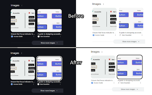
Screenshots
About
I predominantly use my keyboard to navigate websites, but many sites don't always make it clear where the keyboard is focused. This extension aims to help solve that issue by putting a white or black border around the focused element, depending on whichever results in a higher contrast.

Focus Indicator uses multiple strategies to aim for it to work effectively across all websites, but it can't account for every improper accessibility setup. For example, if a site has a focusable element out of the screen's bounds, it won't show any difference. It also doesn't affect which elements are able to be focused with the keyboard.

It prioritizes function over form. If you'd like, you can disable the extension on certain sites (blacklist them) or you can enable the extension only on certain sites (whitelist them). All settings can be configured by clicking on the extension's icon.

There are two focus indication methods, depending on your preference:

1. Overlay (default, new with version 2)
- Works by having a floating outline above the current focused element's position
- Almost guaranteed to show the outline if it is possible to, EVEN IF the focused element is behind another element

2. On Element
- Works by modifying the current element's focused styles
- The indicator will sometimes end up partly or fully covered up by other elements, but it can be less intrusive

Overlay Mode settings:
- Indicator color mode
    - Solid (default) - The outline will be either solid black or solid white
    - Hybrid - The outline will be a black and white inversion of whatever is directly behind each individual portion of it
- Outline width (default: 4px) - Adjust the thickness of the outline
- Outline offset (default: 1px) - Set how much space there is between the element and the outline
- Use transition between focused elements (default: off) - Animates focus shifts for better visual tracking
- Use "On Element" mode for text input elements (default: on) - The overlay may cover text while typing in certain text input elements, mainly in online code editors, so "On Element" mode can be used for just those elements instead
Technical
- Version
- 2.1.4
- Manifest
- V3
- Size
- 25.88KiB
- Min Chrome
- 88
- Languages
- 1
- Featured
- No
Metadata
- ID
- ieandfkgbncmapkpgchnffbodegkemea
- Developer ID
- u13211162c7c07662b5b23f76871facb7
- Developer Email
- [email protected]
- Created
- Apr 22, 2024
- Last Updated (Store)
- Mar 5, 2025
- Last Scraped
- May 25, 2026
- Website
- —
- Support URL
- —
- Privacy Policy
- —
Similar extensions
Alternatives to Focus Indicator, ranked by description similarity.
iPad Touch Cursor
This cursor is made to match the same cursor animations as the cursor introduced into iPadOS.
384
★ 4.8
Reader focus
This extension allows users to focus on single sentences when reading text.
4
Focus Mode Professional
Reduces eye strain by modifying page backgrounds. Click to activate.
13
★ 5.0
Reading Mask
Enhance focus while reading with a customizable highlight that follows your cursor, reducing distractions and eye strain.
152
★ 3.8
HighlightCursor
Makes your highlight big and allows you to change its size.
37
Accessible find in page
An accessibility-focused search tool with customizable colors, optional blinking, and bordered highlights.
36
★ 4.0
FocusFlow: Open Dyslexic Font & Ruler
Boost reading with OpenDyslexic, Lexend & Atkinson fonts, color overlays, focus line, bionic reading & per-site controls.
5.0K
★ 4.6
FocusView
Dim the noise, spotlight what matters. A focus tool for readers, learners, and anyone who needs a calmer screen.
1
Data sourced from the Chrome Web Store · last verified May 25, 2026.