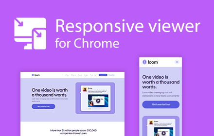
Responsive viewer For Chrome
View multiple screens simultaneously With Responsive viewer For Chrome
As of May 2026, Responsive viewer For Chrome has 3,000 users and a 3.56/5 rating from 9 reviews in the Workflow & Planning category.
Usersno change0%
3.0K
3,000
Ratingno change0%
3.56
9 reviews
Reviewsno change0%
9
Version
0.0.1
Manifest V3
History
1 snapshotsTracking since May 1, 2026.
View as table
| Date | Users | Rating | Reviews | Version |
|---|---|---|---|---|
| May 1, 2026 | 3.0K | 3.56 | 9 | 0.0.1 |
| Now | 3.0K | 3.56 | 9 | 0.0.1 |
Permissions & access
- Permissions
- scriptingactiveTab
- Host access
- None declared
Screenshots
About
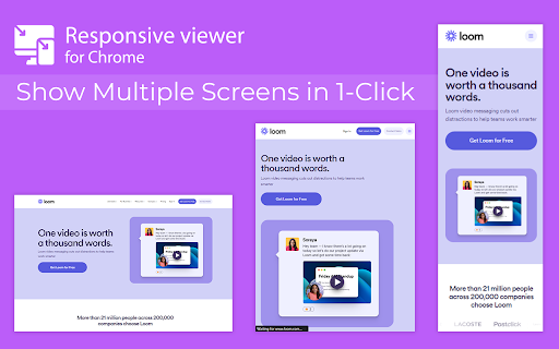
In 2025, ensuring your website looks flawless across all devices is more important than ever. Don’t let your website look ugly when viewed in different devices, you can use Responsive Viewer for Chrome extension. As a device necessary for developers, you have the ability to display several sizes on the screen at once, which makes testing of work in responsive design faster. With two to three clicks, assess and improve broad site structure across different screens, for the best usability.


Key Features:

Multiple Screens in One View: See all the screen resolutions on one page, from mobile-first to desktop-first, if you want to test responsiveness.

Quick Layout Assessments: Exhibit 2 A time saver delivering layout problems in real time respecting device, screen and orientation.

Customizable Configurations: Make your screens, specific resolutions, and spatial orientations correspond with the intended devices.

Enhanced Development Workflow: Be able to easily identify and address problems regarding responsiveness in order to enhance the design operation.


How to Use:

Install the Extension: To get the Responsive Viewer Chrome Extension, go to Chrome Web Store and install it.

Open the Website or App: Open the website or the application that you wish to and it ready for testing.

Activate Responsive View: In your Chrome bar you will see the icon of Responsive Viewer.

Customize View: Orientation and scaling and resizing options are available to help the user in specific and more detailed forms of testing.

Review and Optimize: Make sure that the same layout appears uniformly in all your displays and adjust your site in terms of how well it is user-friendly on each of the devices.

Test with Ease: To minimize discrepancies in performance across different devices, the configurations have to vary.


Why Use Responsive Viewer?

As was described, the Responsive Viewer is intended to simplify the work of testing responsiveness. Developers and designers can now check how their designs work on various devices without flipping between screens. Cut hours off your schedule, make your work more efficient, and make your users’ experience on any device seamless.


FAQs

What is the Responsive Viewer extension?

The Responsive Viewer is a Chrome extension that allows developers to view multiple screen resolutions simultaneously, making it easier to test website responsiveness.

Can I customize screen sizes and orientations?

Yes, you can easily customize the screen sizes, orientations, and resolutions to match the devices you’re testing.

Is it free to use?

Yes, the Responsive Viewer is free to install and use for all Chrome users.

Does this work with any website?

Absolutely! You can test responsiveness on any website or web application by simply activating the extension.

Who can benefit from this extension?

Web developers, designers, and anyone working on responsive web designs will find this tool invaluable for quick and accurate layout testing.
Technical
- Version
- 0.0.1
- Manifest
- V3
- Size
- 25.34KiB
- Min Chrome
- 88
- Languages
- 1
- Featured
- Yes
Metadata
- ID
- geaeebooindfocegjgdfjkbmkekcpobd
- Developer ID
- u0836ddcc131f2cc1728097b211ed505f
- Developer Email
- [email protected]
- Created
- Jun 1, 2023
- Last Updated (Store)
- Jan 23, 2025
- Last Scraped
- May 30, 2026
- Website
- —
- Support URL
- —
- Privacy Policy
- —
Similar extensions
Alternatives to Responsive viewer For Chrome, ranked by description similarity.
Responsive Tester
Test responsive web designs or mobile pages and see if it is mobile friendly
40.0K
★ 3.1
Collaborate.to
A robust bug tracking and visual feedback tool for your website. Collect, organize and act on your feedback without any effort
14
★ 5.0
Capture Full Page
Use Capture Full Page — a lightweight Chrome extension for creating online screen and full web page
screenshots.
1.0K
★ 4.8
Easy Screenshot
Capture full-page screenshots instantly. Manually select any part of the page to capture exactly what you need.
4
Reader View
Strips away clutter like buttons, background images, and changes the page's text size, contrast and layout for better readability
40.0K
★ 4.6
Image Resizer For Chrome Dev
Upload and upscale images using Image Resizer
16
Screen recorder
Elevate your productivity with Screen Recorder tool. Effortlessly capture and share your screen recordings for optimal efficiency.
4.0K
★ 3.6
Easy View
Easy View extension provides a way to view web content in clean and readable view.
10.0K
★ 4.8
Data sourced from the Chrome Web Store · last verified May 30, 2026.