
Layout Viewer
An extension to view the layout of a webpage for different devices.
As of June 2026, Layout Viewer has 9 users and a 5.00/5 rating from 1 reviews in the Developer Tools category.
Usersdown 30.8 percent−30.8%
9
9
Ratingno change0%
5.00
1 reviews
Reviewsno change0%
1
Version
1.1.0
Manifest V3
History
2 snapshotsTracking since May 12, 2026.
View as table
| Date | Users | Rating | Reviews | Version |
|---|---|---|---|---|
| May 12, 2026 | 13 | 5.00 | 1 | 1.1.0 |
| Jun 7, 2026 | 8 | 5.00 | 1 | 1.1.0 |
| Now | 9 | 5.00 | 1 | 1.1.0 |
Permissions & access
- Permissions
- tabsstorage
- Host access
- None declared
Screenshots


About
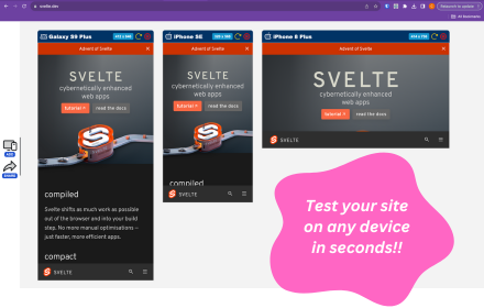
Layout Viewer is a chrome extension that helps frontend developer to view their web pages in different devices and orientation. The idea is inspired by the Chrome only where developers can view the responsiveness of the their web pages by using the developer tool and selecting the different devices. On enabling the Layout Viewer extension a button will be added to the right screen of the all the chrome web pages. On clicking the button a small screen will appear which will open the current open tab UI in the provided iframe inside the extension and having options to choose different devices and orientation. Developers can also add one or more screens of the same tab to choose devices range.

It is built to just help frontend developers to make their web pages more responsive with easiness. It does not store or process any data related with the current opening web page.
Technical
- Version
- 1.1.0
- Manifest
- V3
- Size
- 622KiB
- Min Chrome
- 88
- Languages
- 1
- Featured
- No
Metadata
- ID
- bknccpbgecnfmnniccnibhimnbkdgbdk
- Developer ID
- uea96a259418735621027cfc6a46d33f2
- Developer Email
- [email protected]
- Created
- Jan 2, 2025
- Last Updated (Store)
- Jan 7, 2025
- Last Scraped
- Jun 7, 2026
- Website
- —
- Privacy Policy
- —
Similar extensions
Alternatives to Layout Viewer, ranked by description similarity.
Responsive Preview
Preview websites across multiple device screen sizes simultaneously.
19
Responsive Viewer
Show multiple screens once, Responsive design tester
400.0K
★ 4.2
Device Viewer
Search and view device details from a JSON file.
178
Viewport Dimensions
Displays the current viewport dimensions in real-time as you resize the browser window.
778
★ 3.7
Design Column Overlay
This chrome extension places a dynamic overlay over the current tab so that web engineers can follow configured visual design…
780
★ 5.0
Device Simulator
Simulate mobile and tablet devices on any webpage with realistic device metrics and visual frames.
—
Mobile View: Test responsive designs fast
Test your responsive designs on multiple devices at once.
20.0K
★ 4.3
ResponsiveFrame
Test responsive designs across multiple device viewports simultaneously. by AIO.com.ai
1
Data sourced from the Chrome Web Store · last verified Jun 7, 2026.